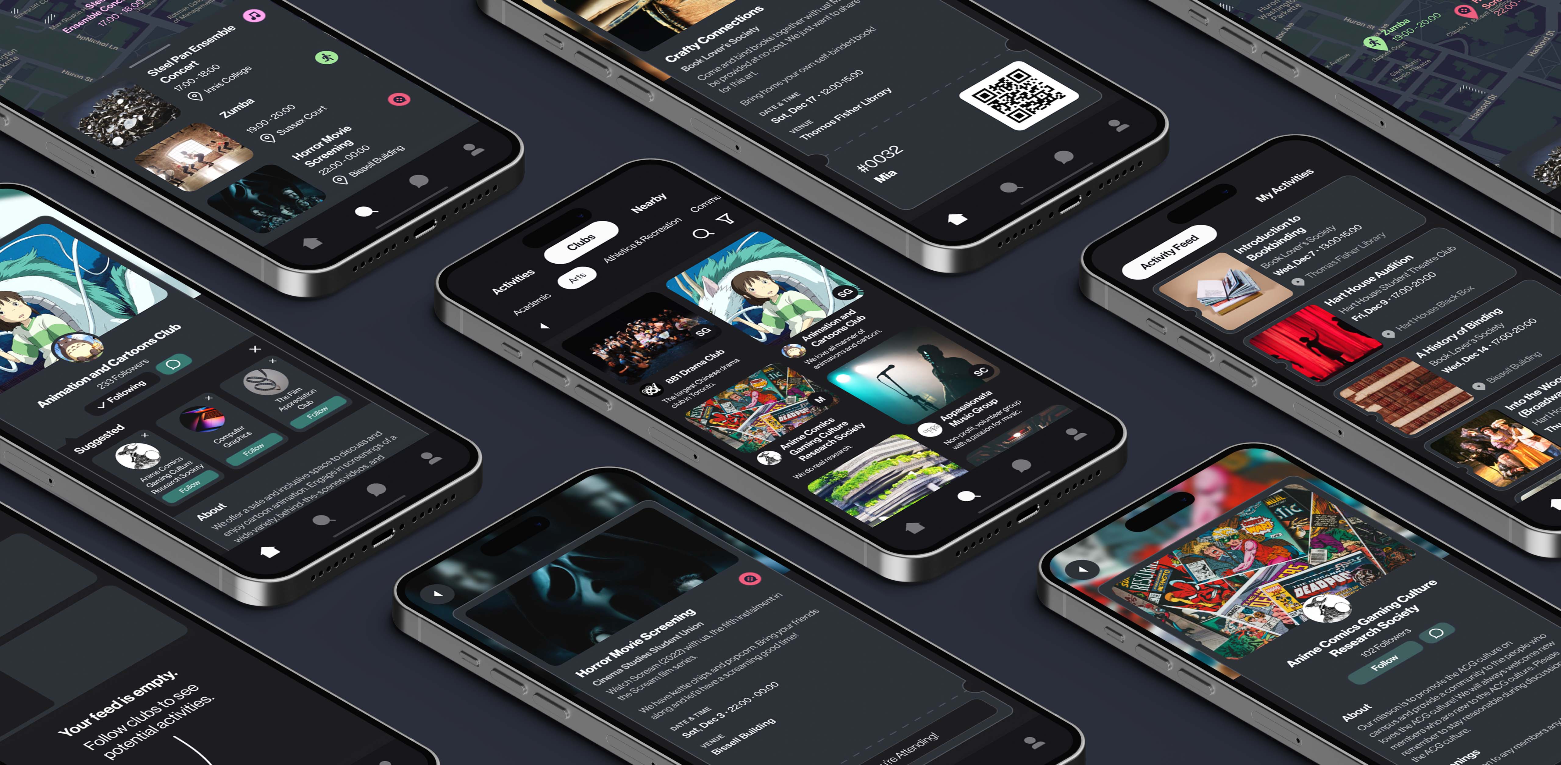
001: The
Problem
Discover
How do students get involved in clubs?
Let's explore this journey through our persona, Mia.
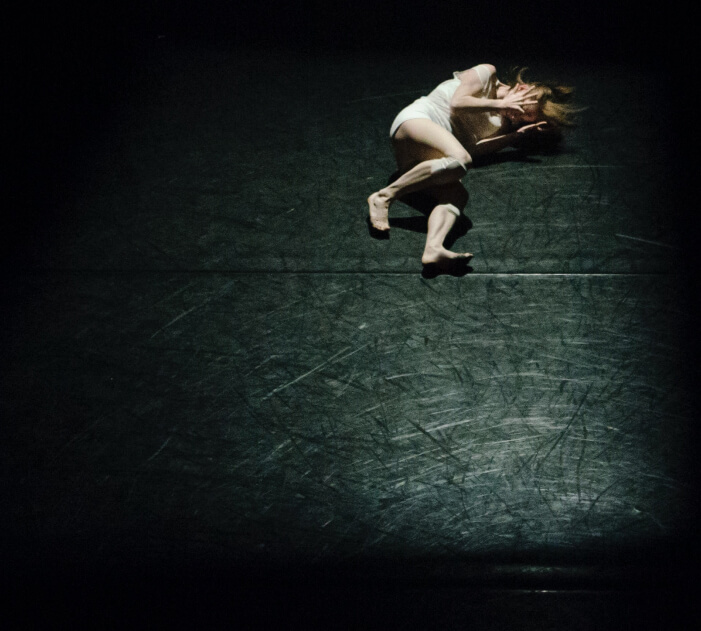
Six months ago, this was Mia acting on stage in high school. She’s a social butterfly who has been in theatre all her life.
But as a freshman new to Toronto, she fails to join a drama club. She misses crucial events like the Club Fair, doesn’t understand the official club portal, and gets no replies from club leaders.
She’s lonely and frustrated. It’s not an act anymore.
She feels alone.
But she’s not alone in this situation.
There are countless other disconnected students who want a community with the same interests.
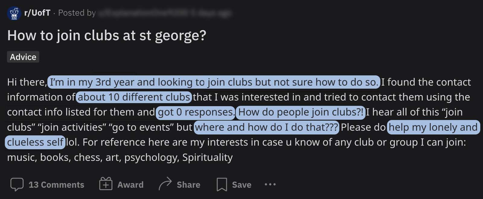
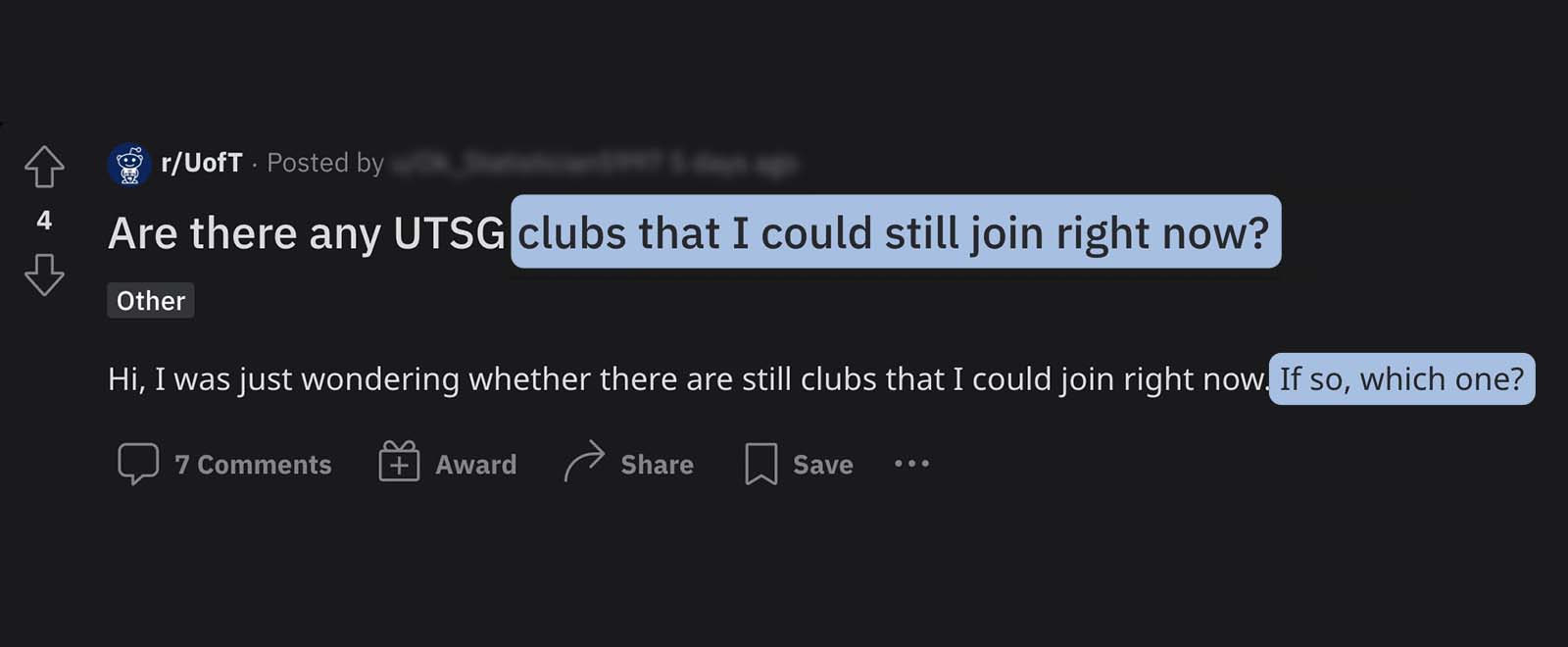


We’re here to foster connectedness and help these students with their two tasks:
Find clubs I’m interested in.
Get involved in those clubs.
002: The
User Research
Discover
Conducting research on existing experiences
I led the user research process. To hear about club involvement first-hand, we conducted a questionnaire and semi-structured interviews. We heard from 50 survey respondents and 9 interviewees.

What is holding people back from joining clubs?
Based on our interviews, I identified three main categories of pain points through affinity diagramming.


We were surprised by some of our findings.
We found that even outgoing, outspoken individuals who knew exactly what they wanted to get involved with weren’t necessarily able to join those clubs. To better visualise this context, we created our persona, Mia, briefly presented in Section 001.
003:
As-Is Experience
Discover
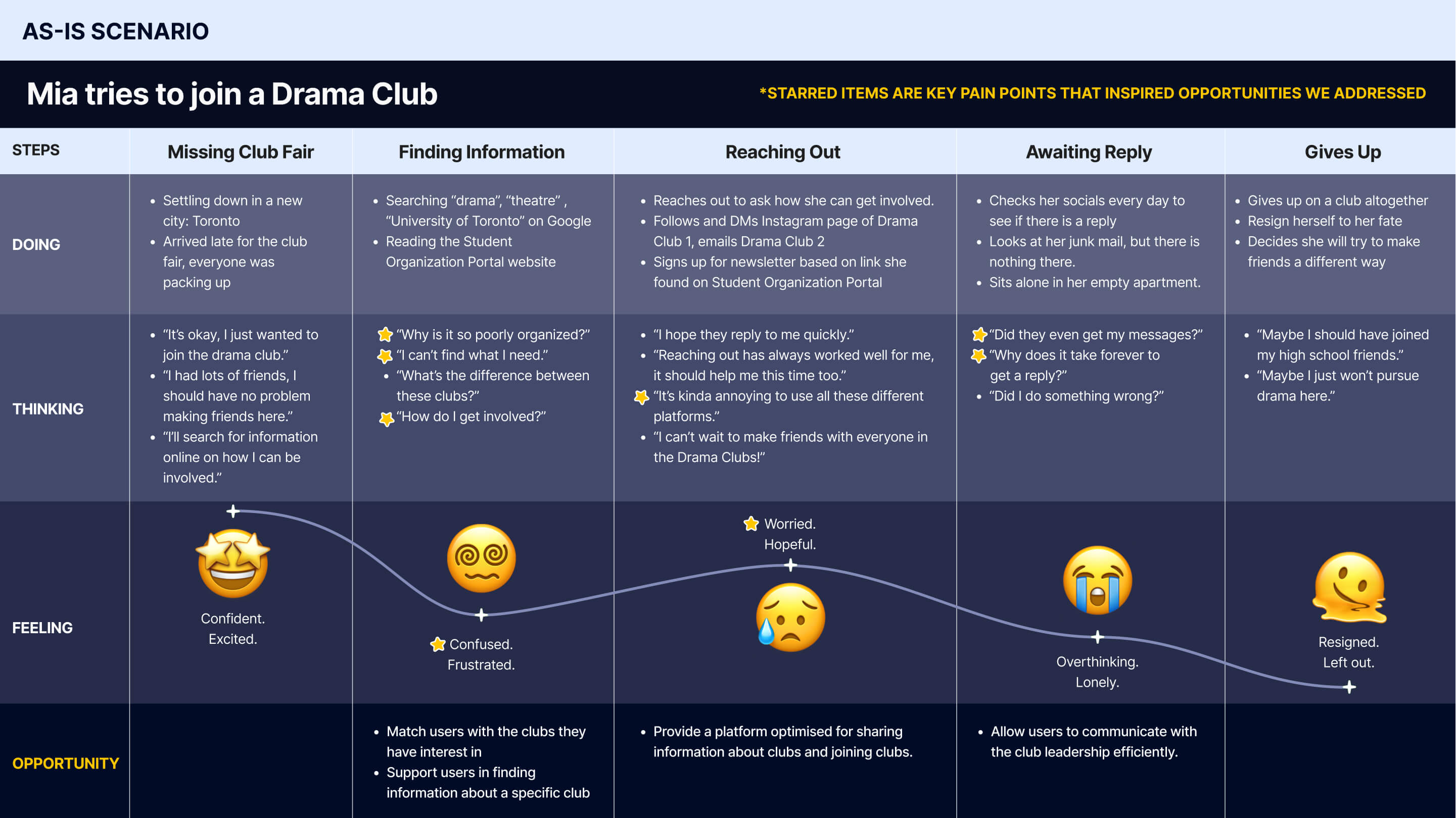
User's Journey Map for joining a club.
Our team used journey mapping to understand how Mia might approach her goal of joining a new drama club and her experience throughout the process.
We gathered our research findings into a scenario "as-is" that detailed how Mia would currently approach her goal. It identified key opportunities for improvement.
004: The
Goals
Define
Our key design goals
To align the team around a single shared mission based on our user research, I crafted three key design goals for our solution as the lead for the user research process. Based on these goals, we proceeded with ideation.


005: The
Ideation
Develop
Creating ideas and evaluating them
We brainstormed countless ideas and dot-voted on those ideas based on impact and feasibility. Here are the top three ideas I came up with.

Run around with your characters like in an MMORPG. Similar clubs are grouped together.
We like:
- The conceptual metaphor
- Sense of exploration
- Not feasible
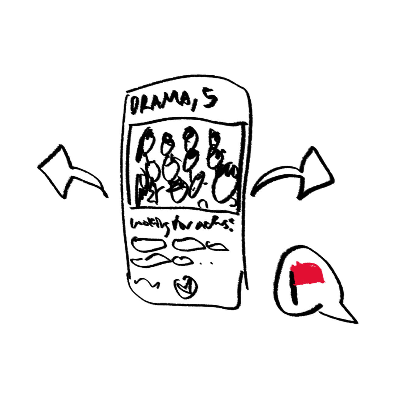
Hinge for Clubs. Swipe through club profiles. Navigate through many options quickly.
We like:
- Engaging, digestible profile
- A two-way process
- Relies on blackbox algorithm
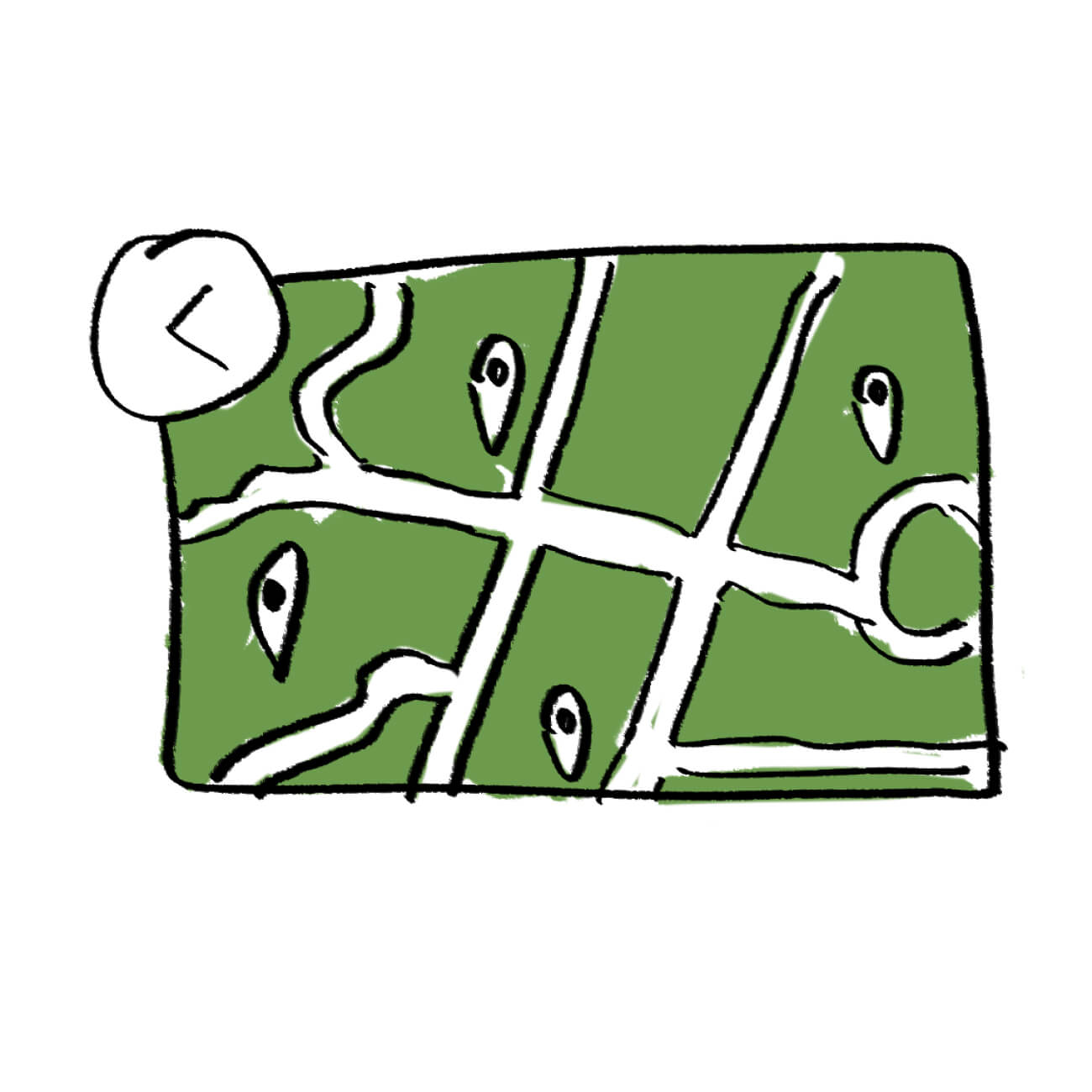
Check a time and place and see what activities are going on. Fill a gap in your schedule.
We like:
- Event-based approach to club involvement
- Inconsistent
006:
The Idea
Develop
Combining the best parts of every idea

We took what we liked from each idea and combined it into an idea we called Flock, a ticket to club involvement. Its key features:
- Explore dating-inspired profiles of clubs like at a digital Club Fair
- Get matches for clubs and communities we know you’d like
- See interesting club activities that fit your packed schedule
- Connect with clubs, let them know who you are as a person
007:
To-Be Scenario
Develop
Envisioning a better future for our users
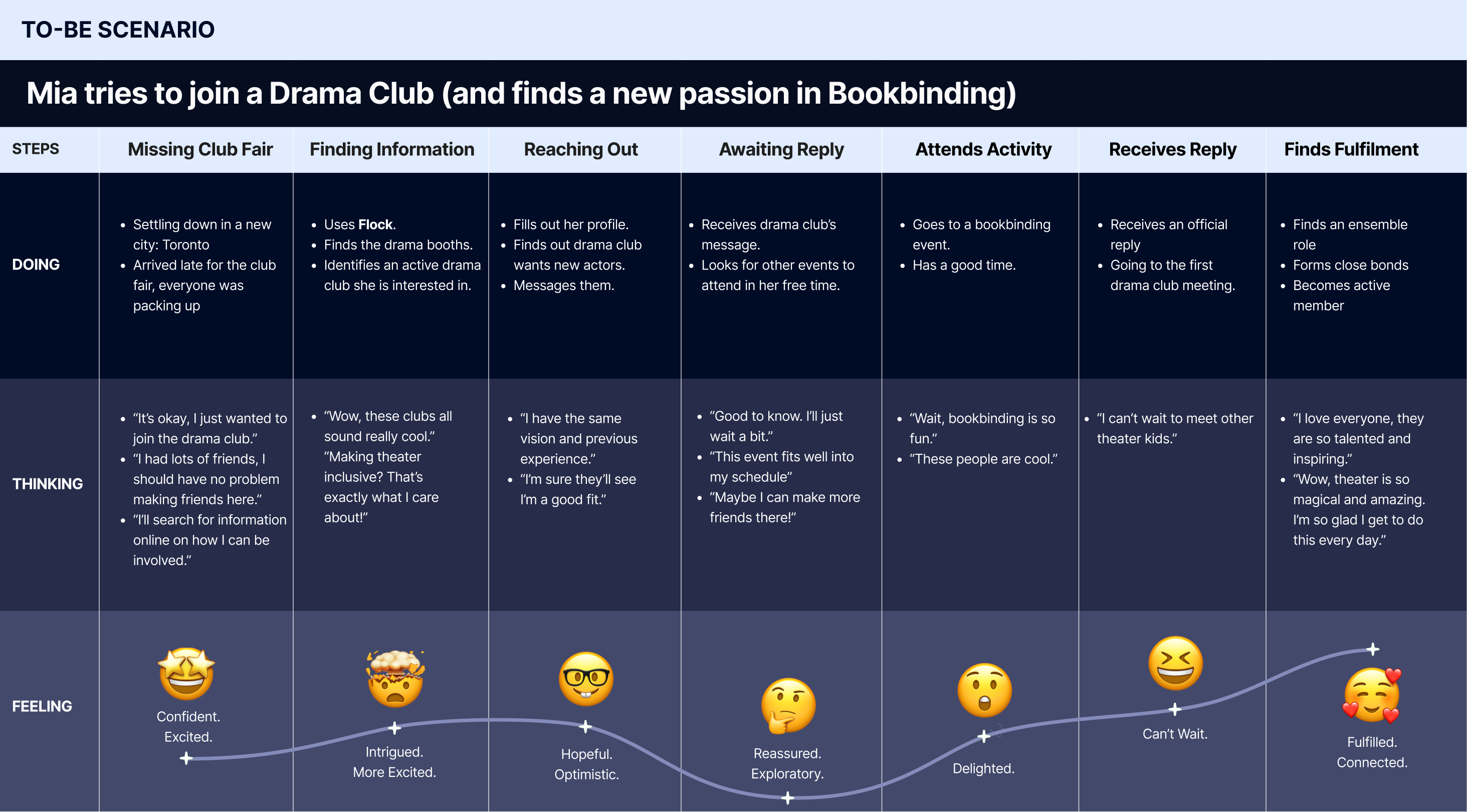
With our direction set, we proceeded with prototyping.
008: The
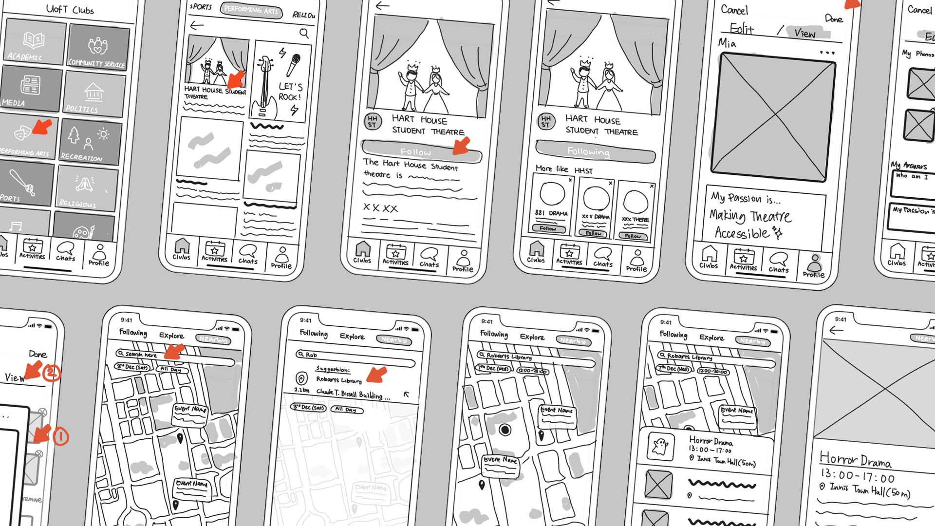
Sketches
Develop
Our low-fidelity sketches
- Finding and following a club I'm interested in.
- Finding information about an activity happening nearby.
- Edit your own profile to include your passions.
009: The
First Investigation
Deliver
Lean evaluation findings and results
To identify issues with the design at an early stage, we conducted a lean evaluation with 6 representative users. We ran a 5-second test, think-aloud testing, and post-testing semi-structured interview. Here are some of our findings.
Before
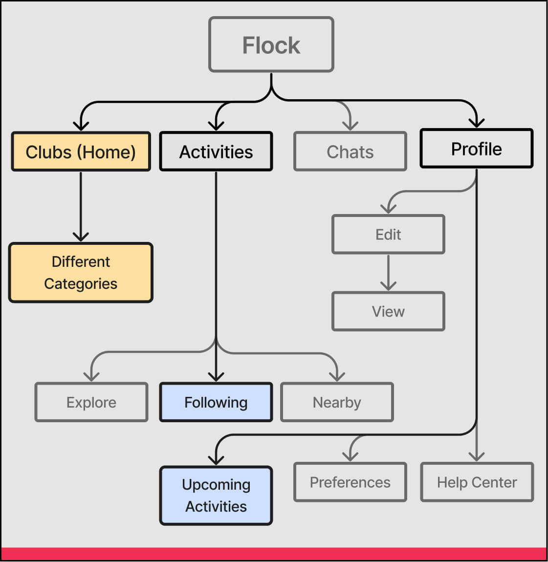
Clubs was originally the Home tab, but searching for clubs was an infrequent task. The most common tasks were likely: 1) Viewing upcoming activities I signed up for 2) Viewing activities from clubs I follow. However, these were hard to discover in the Profile and Activity tab respectively.
After
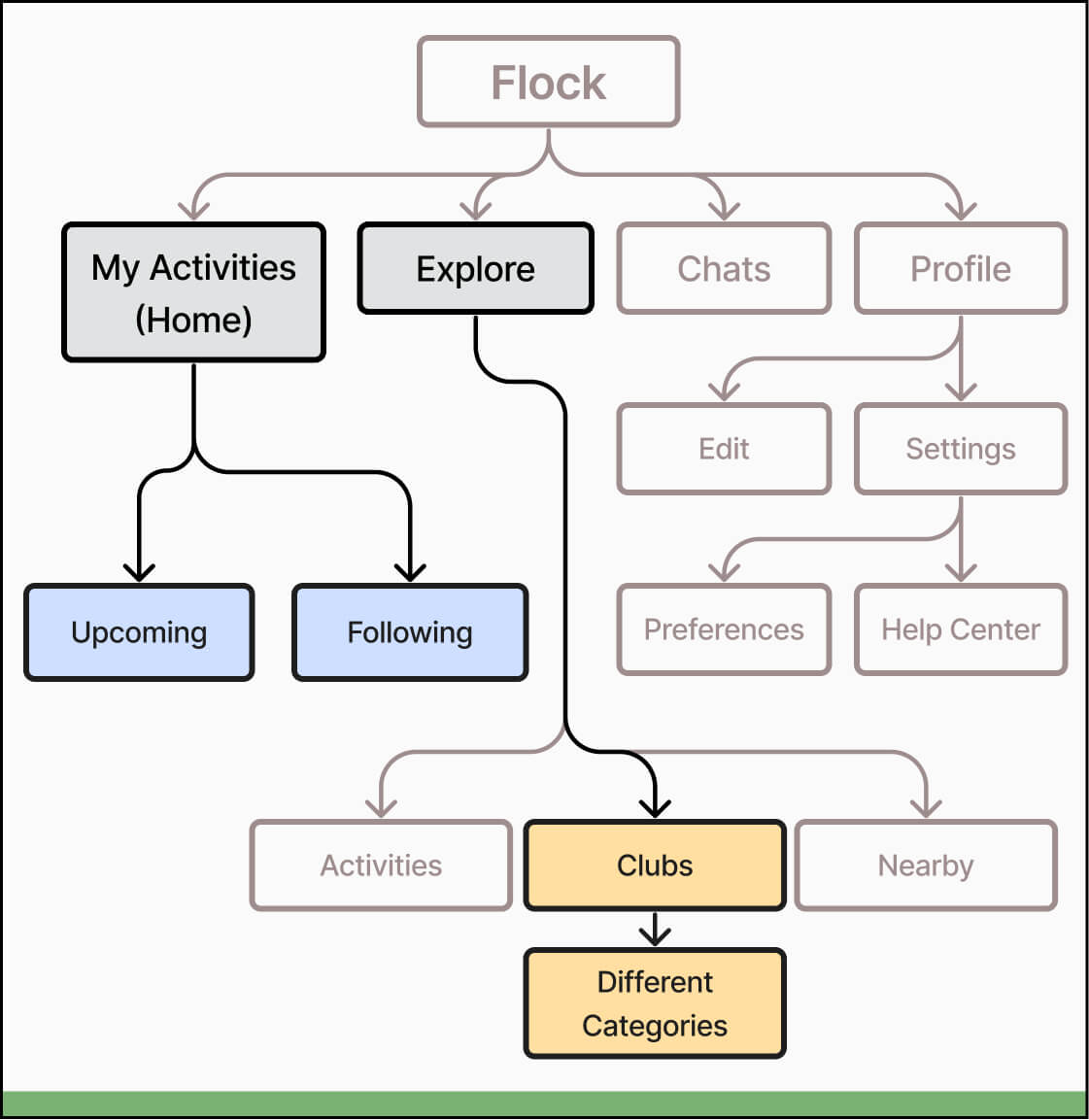
We restructured the information architecture. We took those two main tasks and moved that into the home page. We then combined the rest under an explore tab, which is for new club involvement.
Before
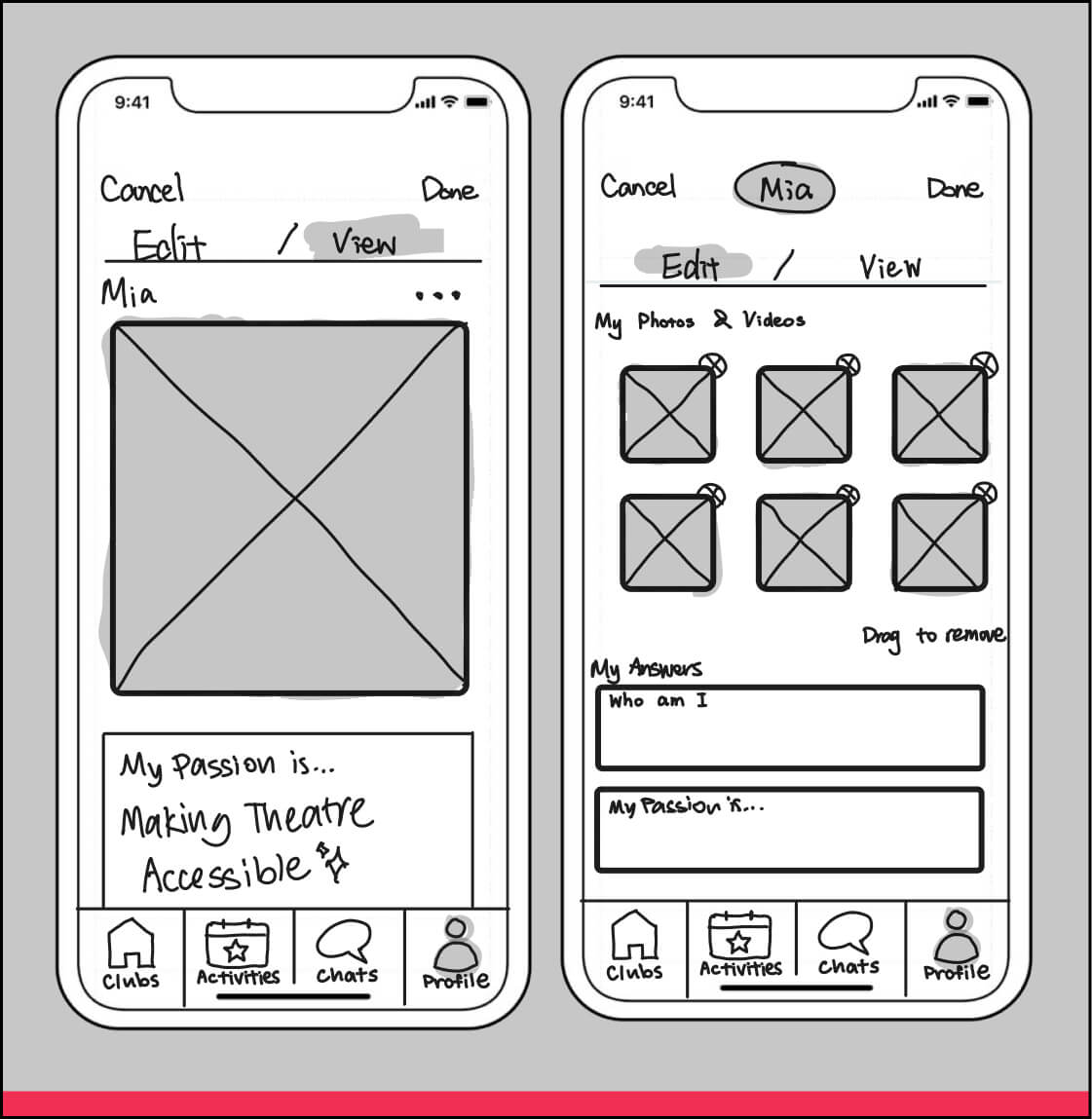
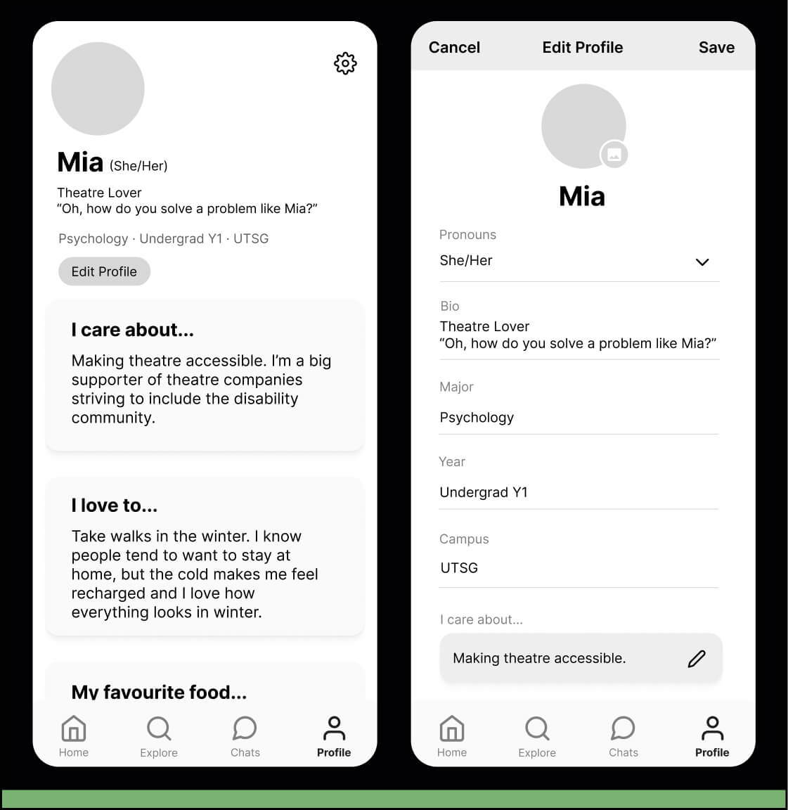
We were surprised to find that participants felt uncomfortable because the layout reminded them of a dating app. They felt embarassed having so many photos of themselves on an official platform. The familiarity of dating interfaces backfired on us.
After
We retained the customizability of the prompts, but kept just one photo. The final interface drew more from LinkedIn to make it feel more official and formal, with additional professional information like faculty and year.
010: The
Storyboards
Deliver
Medium fidelity designs and storyboards
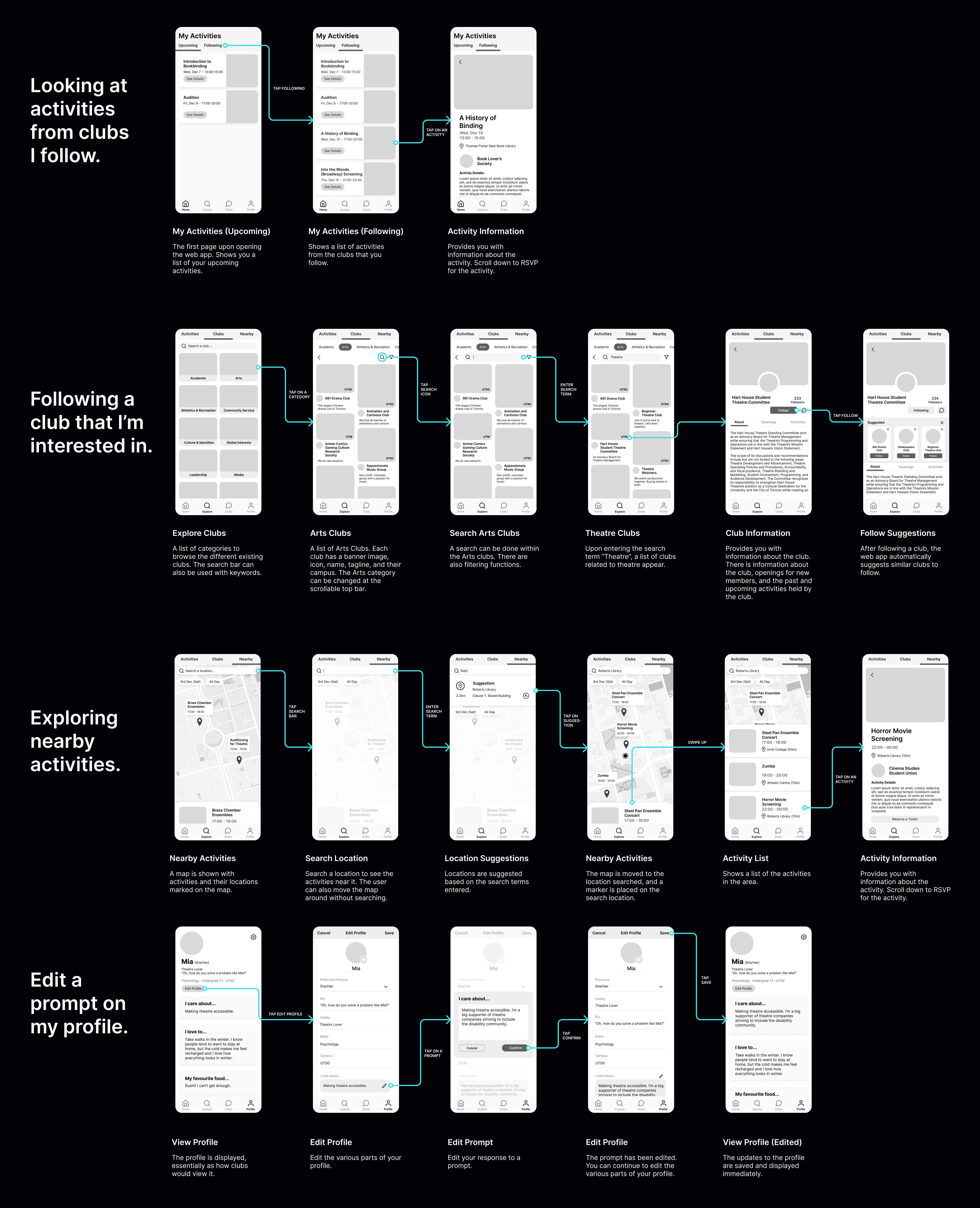
Based on our evaluation, we produced a mid-fidelity prototype. I set up an initial component library and edited everyone's screens to match the same visual style at the end. I created a storyboard to present the flows, as shown below.
011: The
Second Investigation
Deliver
Usability Testing Findings and Results
We conducted another series of usability tests with our mid-fidelity prototype and 6 representative users. Here are key findings:
Before
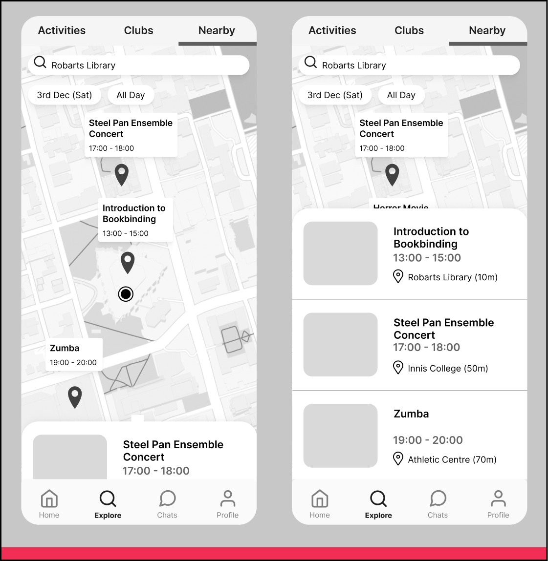
Participants liked the nearby exploring feature. However, they found the search location marker confusing and wanted more information on the map. Most participants did not realise they could swipe the bottom menu up.
After
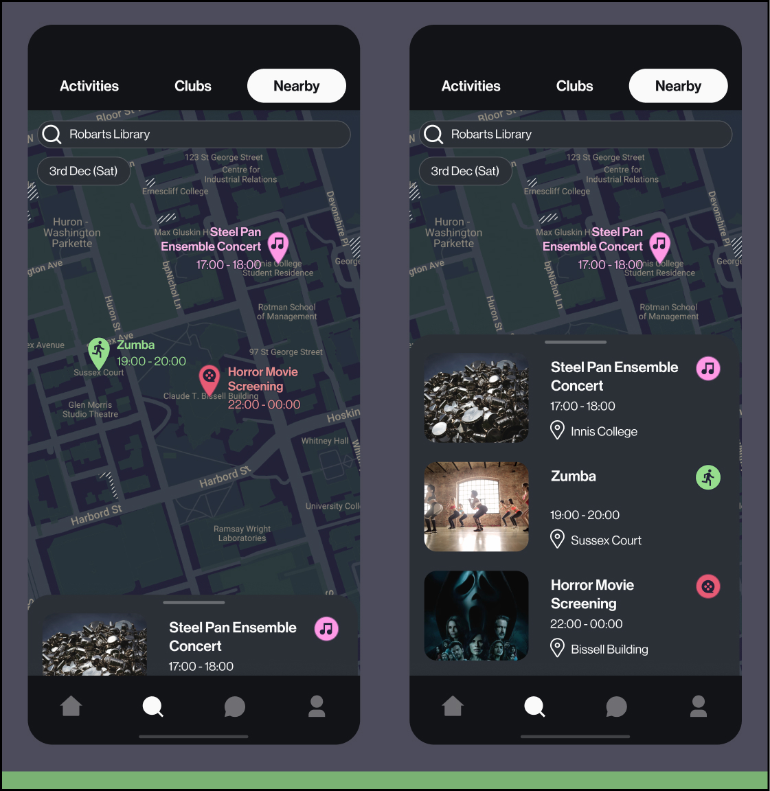
I removed the search marker and added category markers to the activities. I also added a handle to the bottom menu.
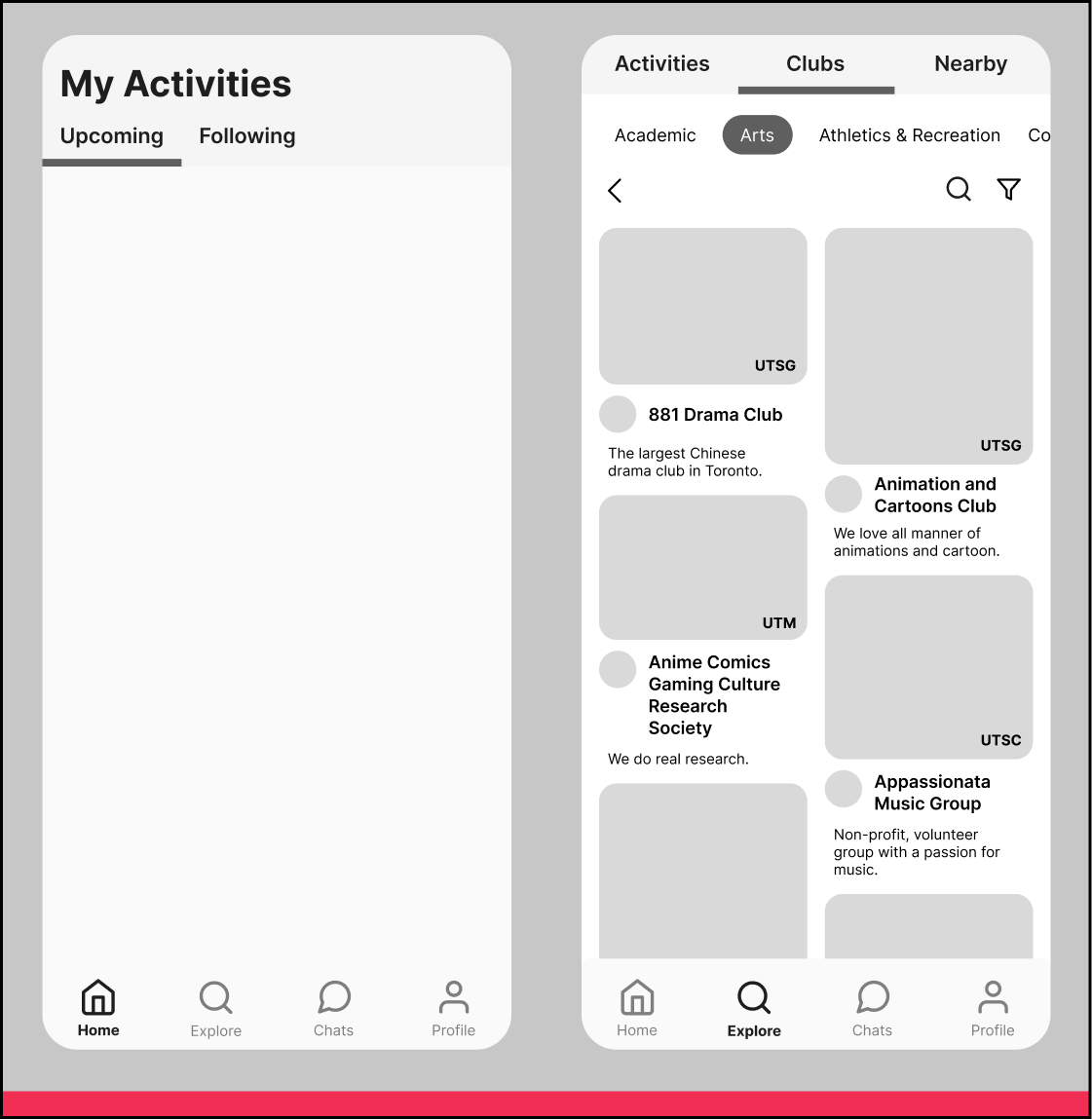
Before
Participants were overwhelmed by the empty home screen and did not know what to do.
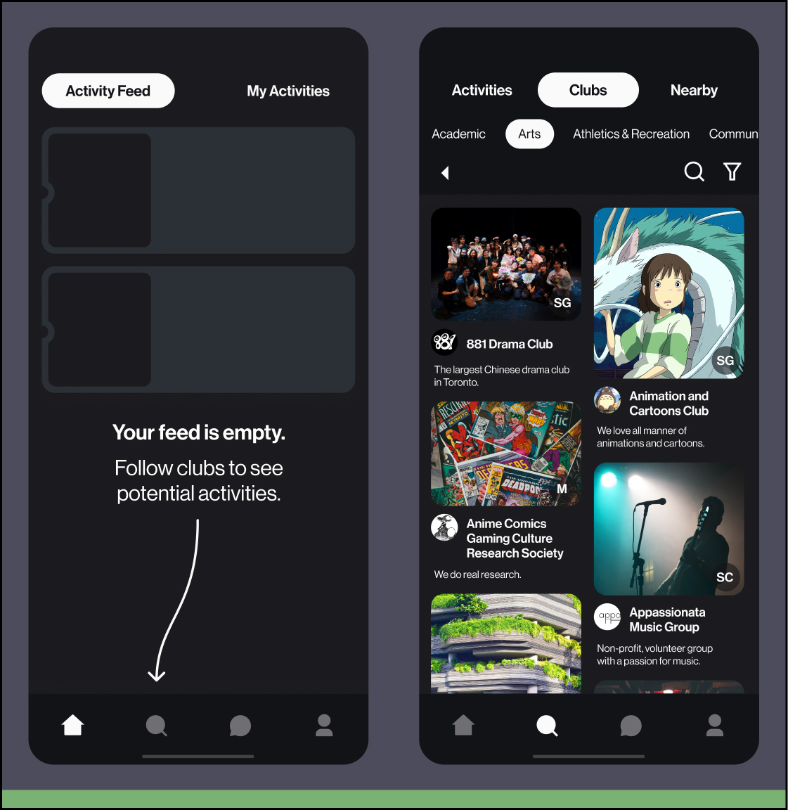
After
I added a call to action to direct users to the explore tab to look for clubs and activities. I would also add a better onboarding process for new users that helps them to follow an initial set of clubs that interest them.
012: The
Product
Deliver
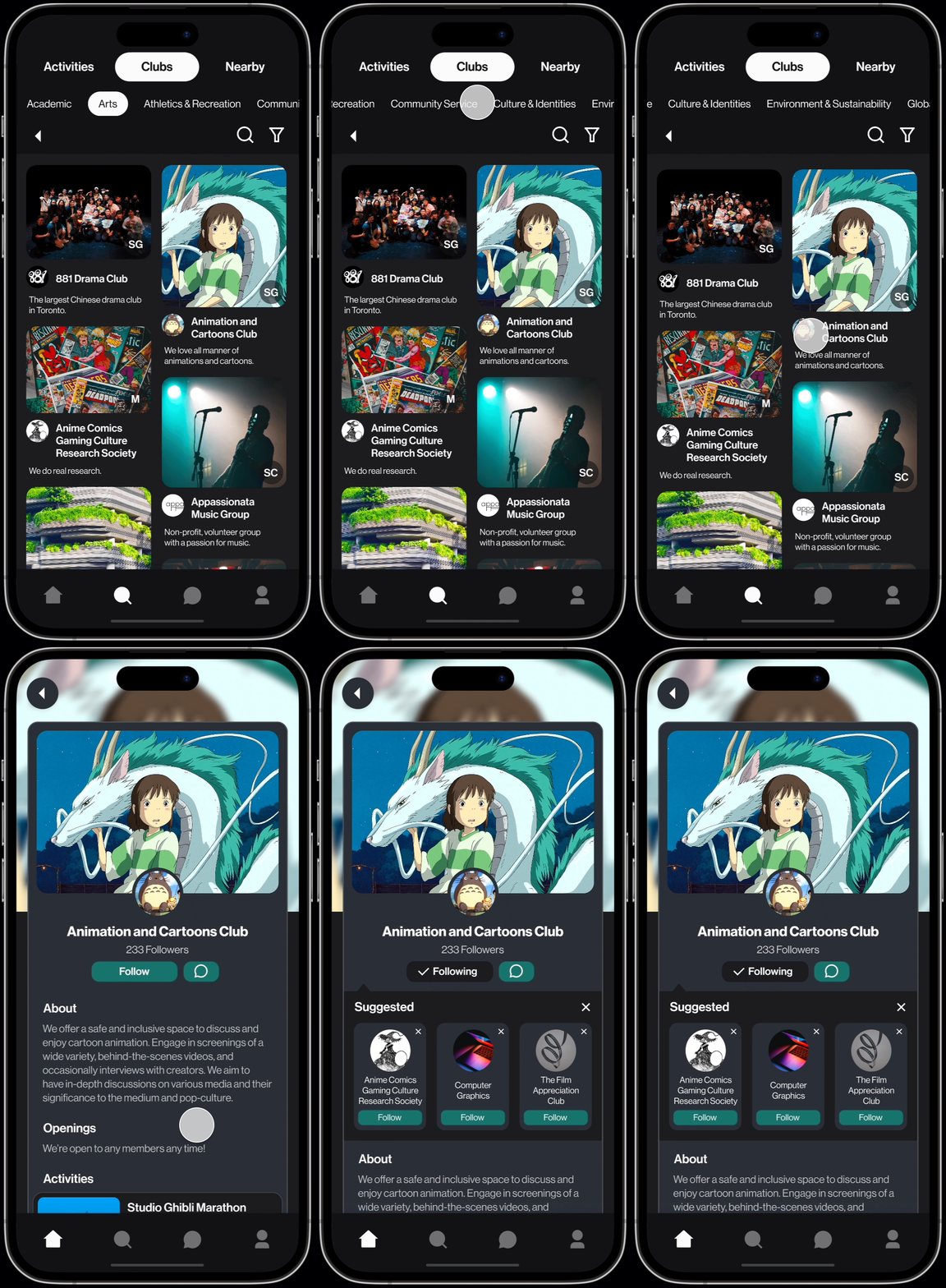
Final Product, high fidelity prototype
Based on the usability testing feedback, I created a finalised high fidelity prototype, presented below.
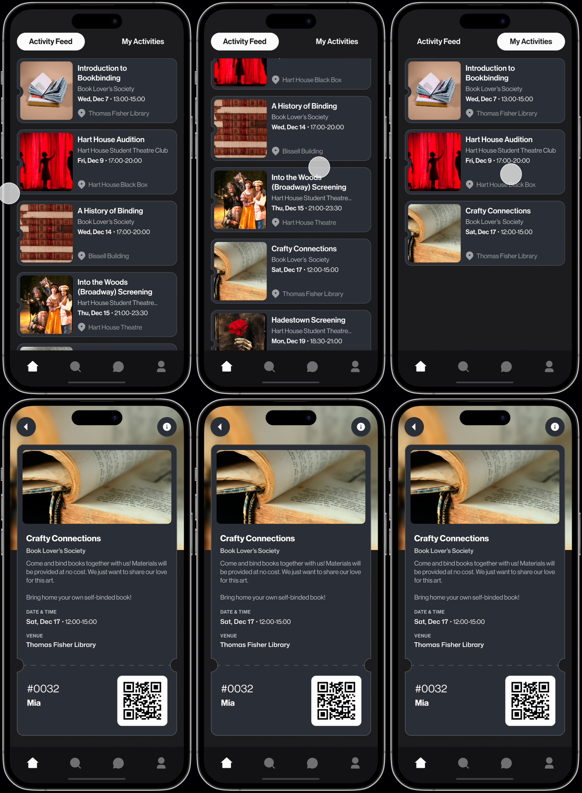
Browse activities from clubs you follow. Keep track of RSVPed activities and show your ticket when you show up.
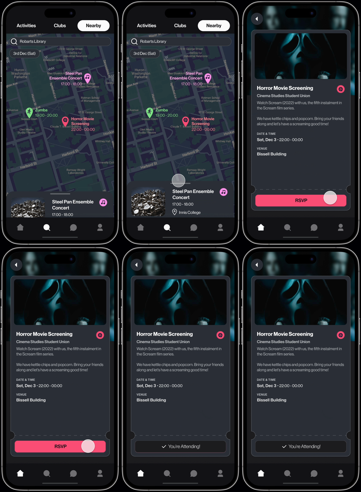
Look for activities based on location and time. Plan ahead or find something to do right now. One-tap RSVPs.
Find and follow the clubs you're interested in. Get related suggestions.
013:
Addressing Goals
Deliver
Flock aligns with our Design Goals, enabling users to:


014:
The Future
Deliver
So, what's next for Flock?


015: My Takeaways and
Reflections

Intentionality in Storytelling.
Fortnightly, I would present the project to industry experts from companies like Google and IBM. With only 8 minutes per presentation and having more content to present each time, I had to be particularly intentional with what I chose to include and what I chose to emphasise. Furthermore, the audience was new each time, so they had to be quickly brought up to speed. I found good practice using the power of a simple but compelling narrative to string along the most exciting parts of a project.

Learning Together.
I was working with a team of 5 emerging UX designers. Initially, I found myself often frustrated. Let's take the example of using Figma. I would discover content not in frames, many random instances detached, font styles replaced, even screens deleted. Through the process, I learnt to focus on growth of my team. I ran mini-workshops to teach my teammates Figma, shared resources, even linked them up to virtual workshops ran by Figma designers. Ultimately, we worked more efficiently and successfully by learning together.
